Understanding positioning in CSS
Positioning in CSS defines where an HTML element will be placed within a HTML page and how each HTML element affects the position of elements around it. Positioning is achieved via many methods, including the normal document flow, floats, and several types of positioned elements.
Types of Positioning
The CSS position property has 5 values.
staticrelativeabsolutefixedsticky
1. static
This is the default value. Any element that is positioned static, is in its normal document flow. A statically positioned element will ignore any values for the properties, top, right, bottom, and left as well as any z-index declarations.
position: static;2. relative
The position of the element depends on the flow of the document. However, relatively positioned elements will accept any values for the properties, top, right, bottom, and left as well as any z-index declarations.
<div className="box"><h2>Static</h2></div>
<div className="box" id="position"><h2>relative</h2></div>
<div className="box"><h2>Static</h2></div>
.box {
  display: inline-block;
  background: #d93025;
}

h2 {
  padding: 40px;
}

#position {
  position: relative;
  top: 30px;
  left: 30px;
  background: #63bc00;
}
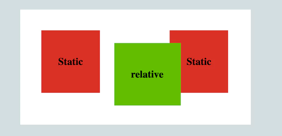
Here, the box will move 30 pixels from left and 30px from top from its original position.
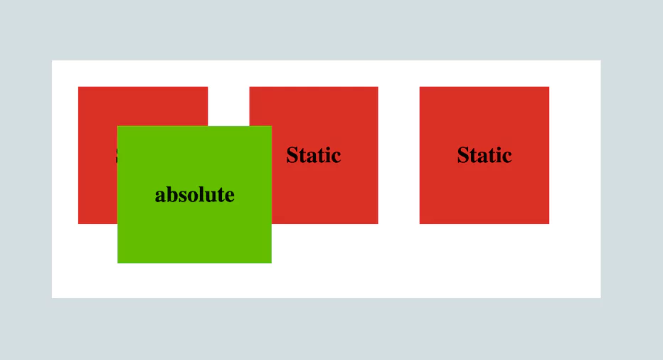
3. absolute
Absolutely positioned elements are removed from the normal document flow and lose their original position. The element next to it takes the position of that element. As far as the elements around them are concerned, the absolutely positioned element doesn’t exist. To position an element absolutely, we need to make the parent element of that particular element positioned relatively or it will be positioned with reference to window viewport.
<div className="box"><h2>Static</h2></div>
<div className="box"><h2>Static</h2></div>
<div className="box"><h2>Static</h2></div>
<div className="box" id="position"><h2>absolute</h2></div>
.box {
  display: inline-block;
  background: #d93025;
  text-align: center;
  margin: 20px;
}

h2 {
  padding: 40px;
}

#position {
  position: absolute;
  top: 50px;
  left: 50px;
  background: #63bc00;
}
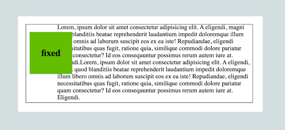
4. fixed
Similar to absolute positioning, fixed positioned elements are removed from the normal document flow. Unlike the absolutely positioned element, a fixed positioned element always works with reference to the window viewport and does not move along with the content as we scroll the page.
<div className="container">
  <p>Lorem, ipsum dolor sit amet ....</p>
  <div id="one"><h2>fixed</h2></div>
</div>
.container {
  border: 1px solid #000;
  width: 500px;
  height: 200px;
  overflow: scroll;
  padding-left: 80px;
}

h2 {
  padding: 20px 30px;
}

#one {
  position: fixed;
  top: 40px;
  left: 30px;
  background: #63bc00;
}
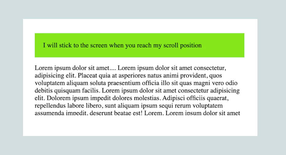
5. sticky
Sticky is similar to relative positioning, but it doesn’t remove an element from the normal document flow. Sticky positioning is a hybrid of relative and fixed positioning. The element is treated as relative positioned until it crosses a specified threshold, at which point it is treated as fixed positioned.
<div className="container">
  <p>Lorem ipsum dolor sit amet....</p>
  <div className="box">
    I will stick to the screen when you reach my scroll position
  </div>
  <p>Lorem ipsum dolor sit amet....</p>
</div>
.box {
  position: sticky;
  top: 0;
  padding: 20px;
  background: #85e617;
}

.container {
  width: 500px;
  height: 200px;
  overflow: scroll;
  padding: 0px 40px;
}